Branding
Branding is often misunderstood as something purely visual, but at its core, it’s about clarity, trust, and consistency. A strong brand helps people understand what a business stands for, what it offers, and why it matters.
Through my work in branding, I’ve learned how decisions around language, design, and storytelling directly influence how organizations are perceived and how effectively they communicate their value. This perspective has naturally shaped my pursuit of an MBA, where I’m focused on understanding how branding fits into larger business systems, from strategy and operations to growth and sustainability. To me, branding is one of the ways strategy becomes visible and actionable.
A Tale of 2 Chilis
Context
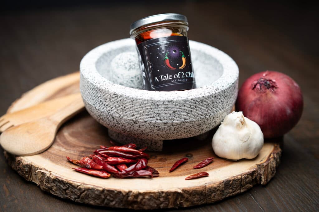
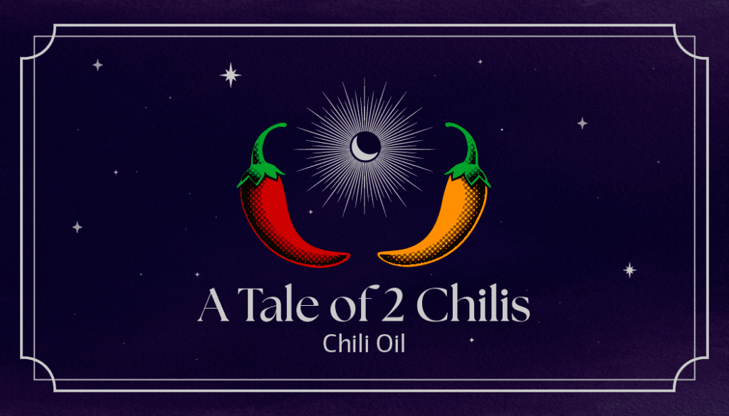
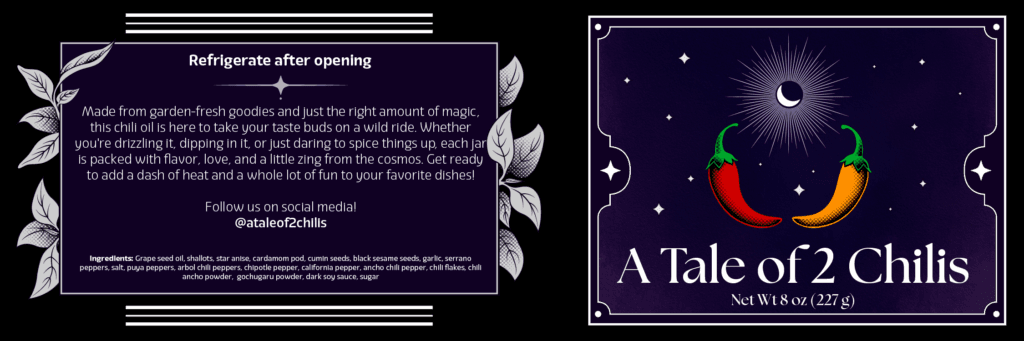
A Tale of 2 Chilis is a small-batch chili oil business in its early stages. When I became involved, the product concept was taking shape, but the brand had not yet been clearly defined or translated into something ready for launch.
The Challenge
The founder had a strong personal vision for the product but needed support clarifying how that vision should be communicated to customers. Key questions around positioning, presentation, and tone were still open, and there was no clear framework for how branding could support the business as it launched and grew.
My Role
I worked closely with the founder as a collaborator, helping clarify brand direction and translate abstract ideas into concrete branding decisions. My role involved supporting early alignment around what the product represented and how it should be presented, while keeping launch readiness in mind.
Approach
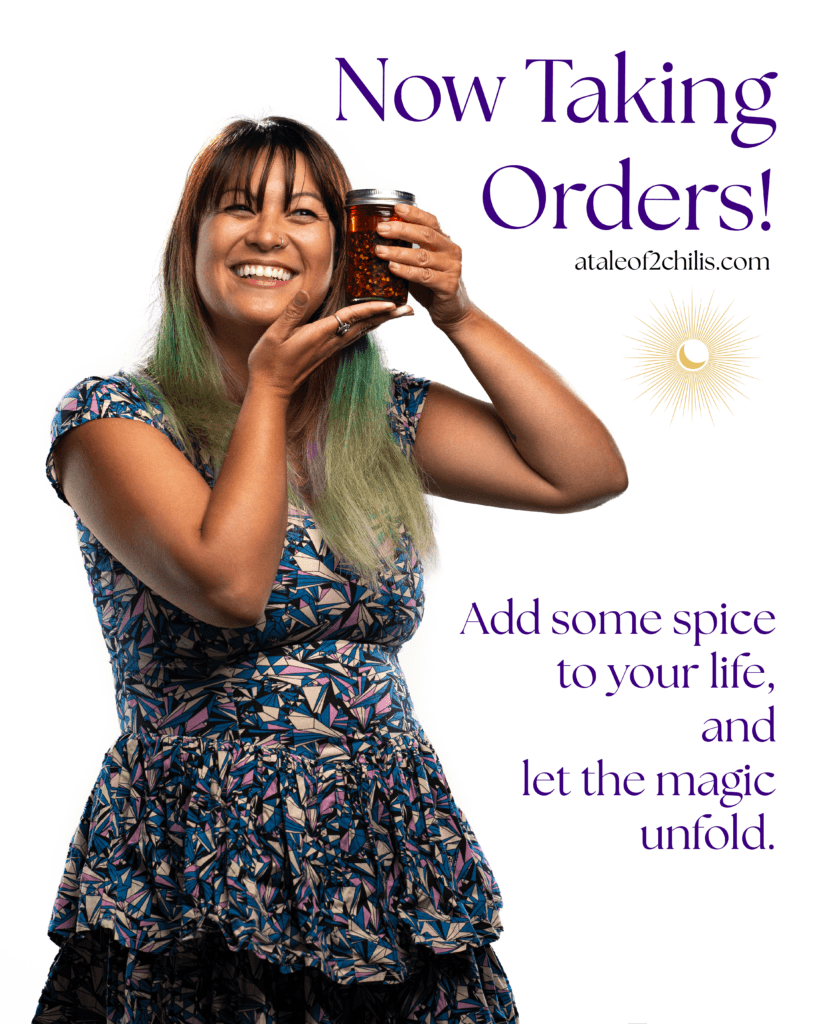
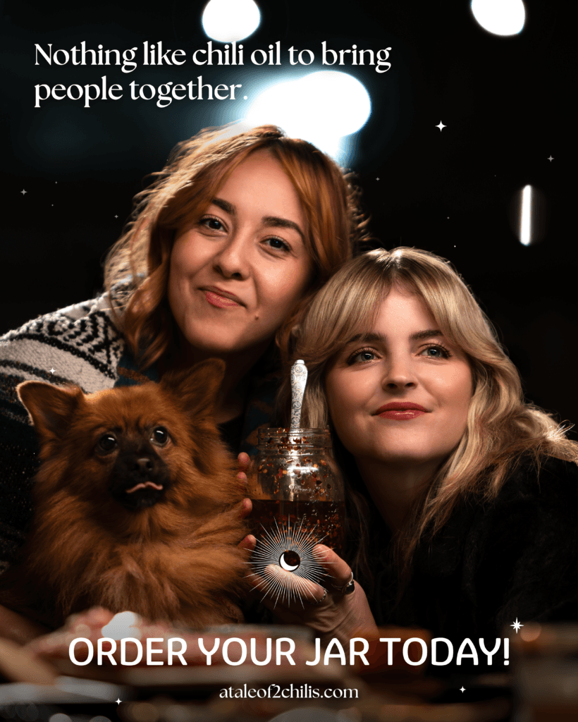
I approached this project by treating branding as a tool for clarity rather than decoration. The focus was on understanding the core of the product—what it was, who it was for, and what made it distinct—before translating that understanding into visual and narrative elements. Branding decisions were used to guide broader choices around packaging, presentation, and consistency as the business moved toward launch.
Outcome
The result was a cohesive brand foundation that supported a successful product launch. More importantly, the founder gained a clearer framework for making future decisions as the business continues to evolve, with branding acting as a point of reference rather than a fixed endpoint.
Sample Work
IndigiGenius
Context
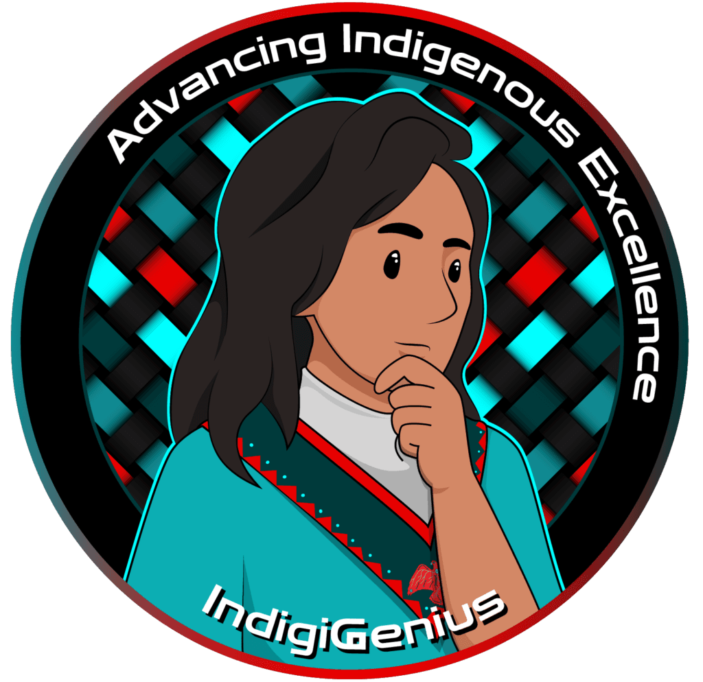
IndigiGenius is a nonprofit organization focused on increasing Indigenous representation in advanced technology fields. When I became involved, the organization was growing quickly across programs and initiatives, and there was a need for greater visual and narrative consistency across its communications.
The Challenge
As the organization expanded, its messaging and visual presence varied across platforms and programs. The challenge was to create a brand foundation that respected the organization’s values and community-centered mission while also supporting clarity, professionalism, and consistency for external audiences.
My Role
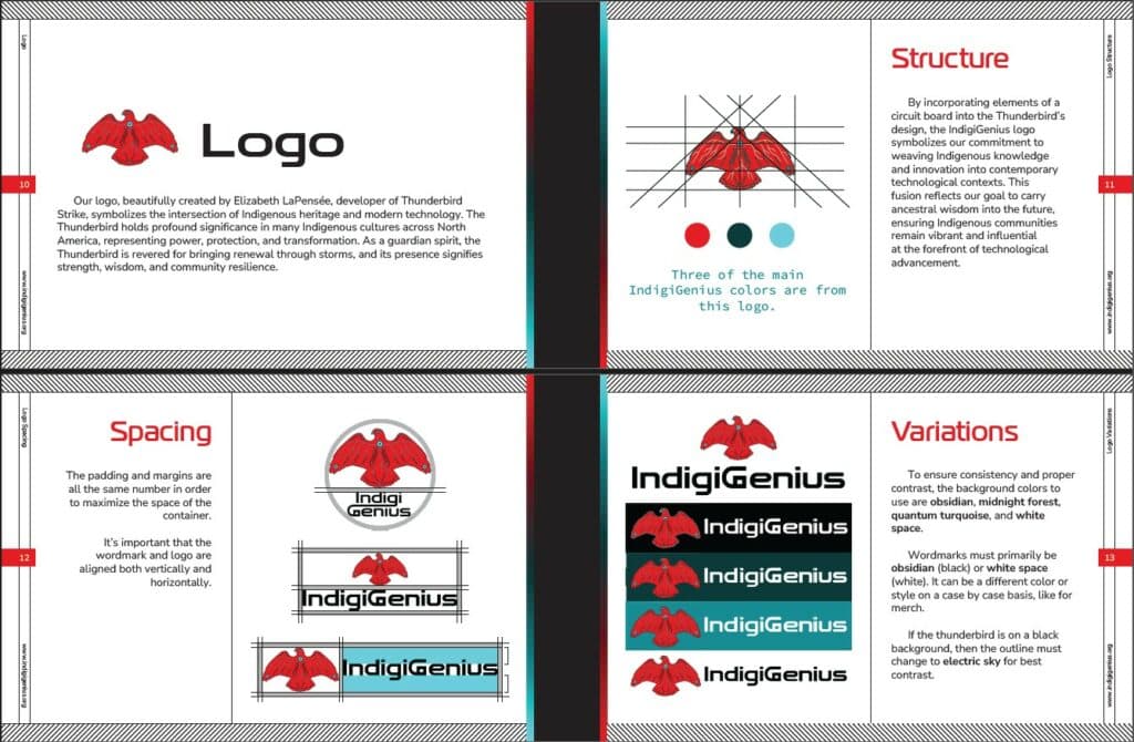
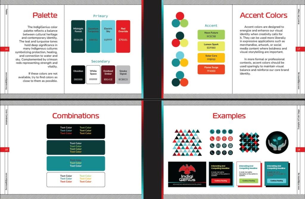
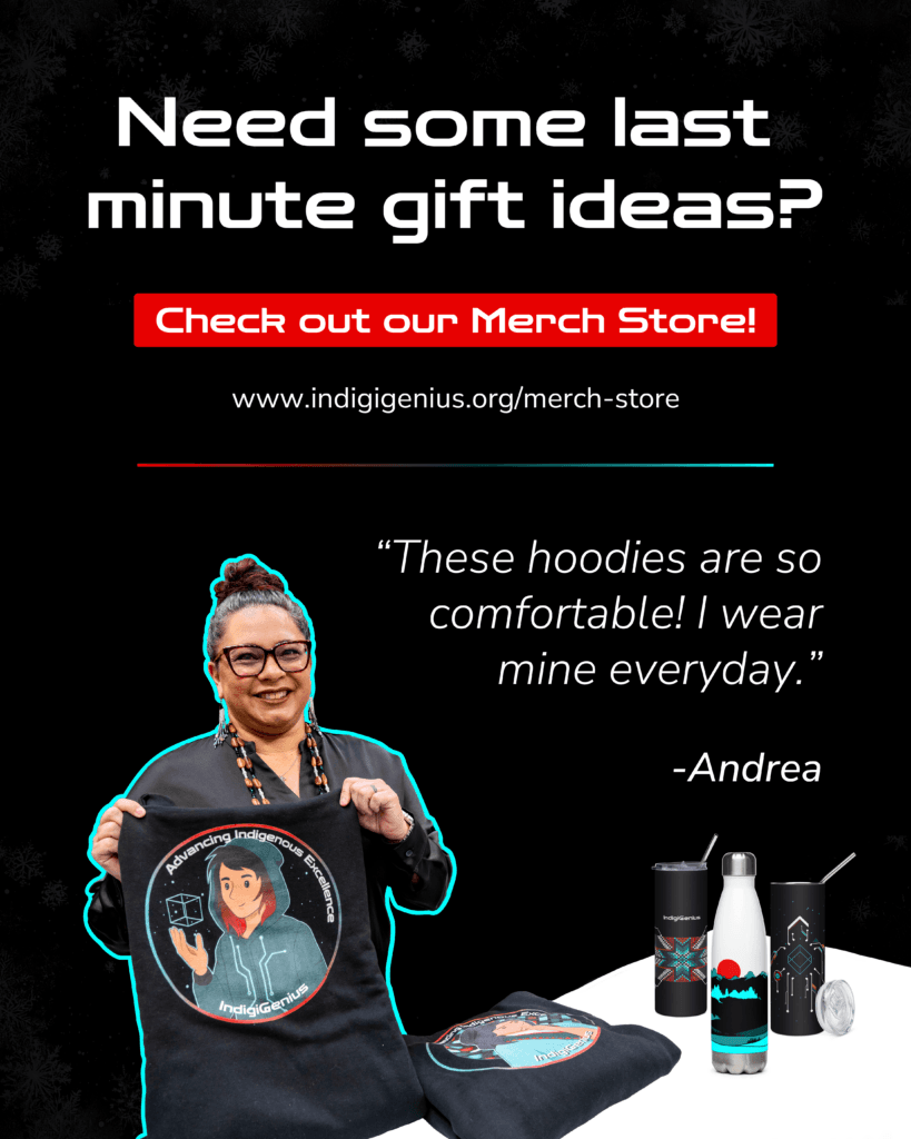
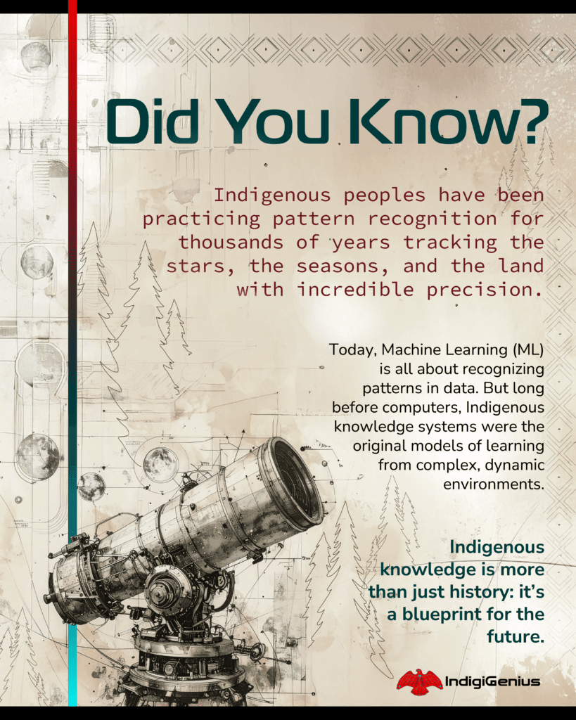
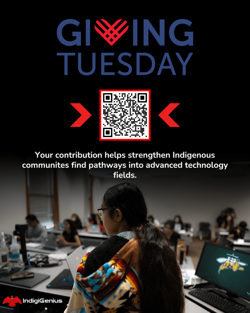
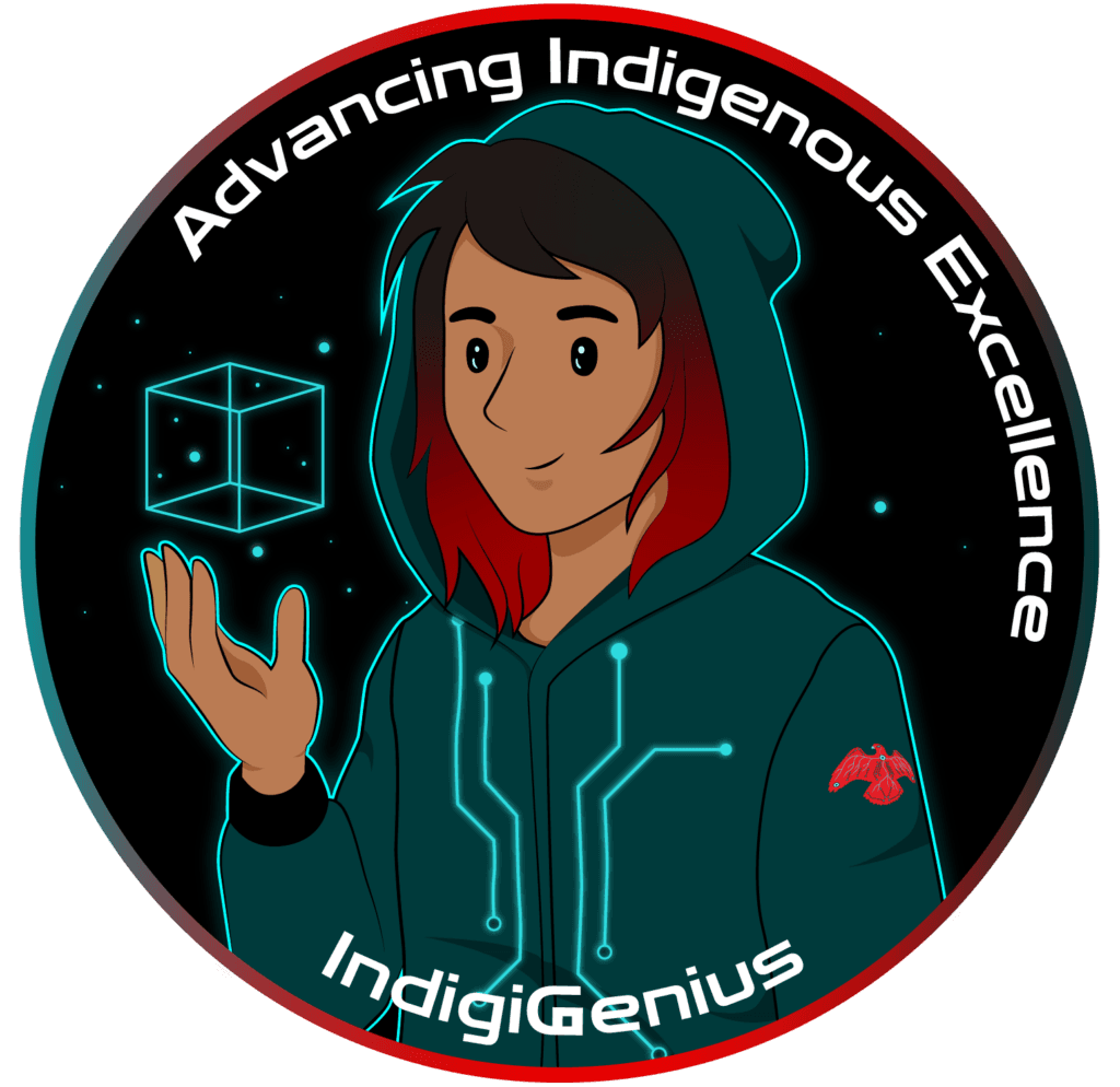
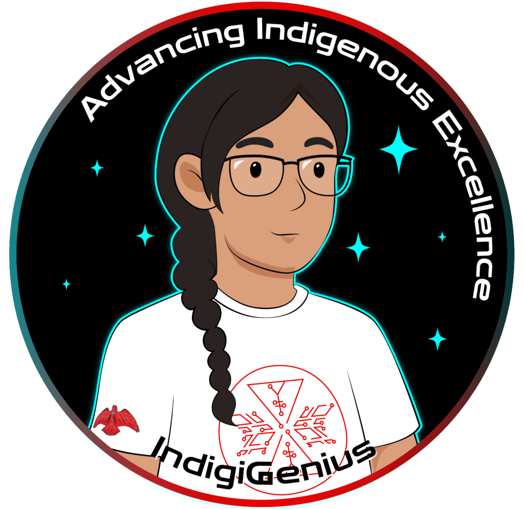
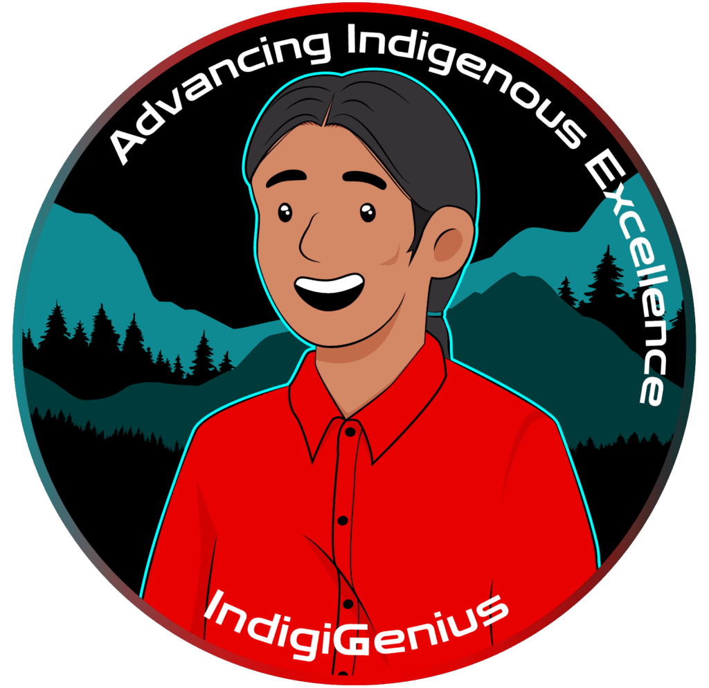
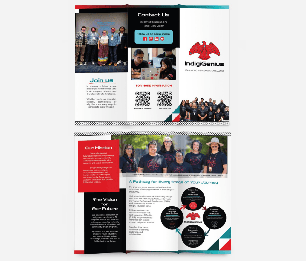
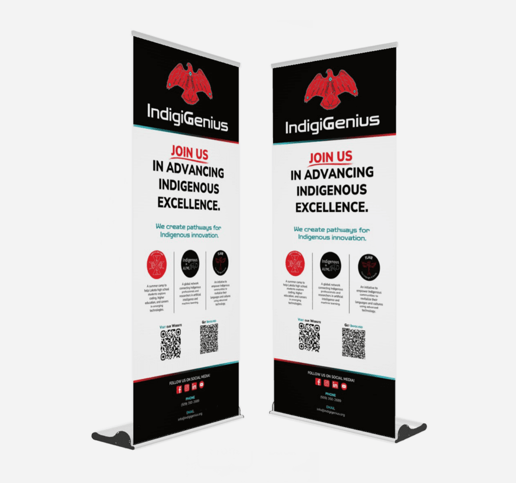
I supported IndigiGenius by helping develop and apply branding guidelines across digital and print materials. My role involved translating organizational values into usable brand elements and working collaboratively with internal stakeholders to ensure the brand could be applied consistently across programs without feeling rigid or disconnected from community context.
Approach
I approached branding for IndigiGenius as a system rather than a set of isolated assets. The focus was on creating flexibility within structure—developing guidelines that could support multiple programs while maintaining a cohesive organizational identity. Branding decisions were informed by the organization’s mission, audience needs, and the practical realities of ongoing communication work.
Outcome
The result was a clearer, more consistent brand presence across platforms, supporting both internal alignment and external communication. The organization gained a stronger foundation for storytelling, outreach, and future growth, with branding acting as a shared reference point rather than a constraint.
Sample Work
McCurley Dealerships
Context
McCurley Dealerships is a multi-location dealership group with an established brand presence. I worked with McCurley during my undergraduate studies, supporting the creation of branded video and digital content used across dealership and community channels.
The Challenge
The challenge was to produce engaging, on-brand content at a consistent pace while working within an existing brand identity. Content needed to feel cohesive across locations, remain aligned with brand standards, and support visibility and engagement goals without overcomplicating production.
My Role
I planned, filmed, edited, and published short-form and long-form video content, while coordinating with internal teams to ensure timely delivery. My role focused on translating McCurley’s brand into repeatable content formats that could be used across platforms and adapted to different dealership contexts.
Approach
I approached this work with an emphasis on brand consistency and practicality. Rather than treating each piece of content as a standalone project, I focused on creating repeatable structures and visual patterns that aligned with McCurley’s brand guidelines. This made it easier to maintain quality and coherence while producing content efficiently and at scale.
Outcome
The resulting content supported McCurley’s online presence across social and community-facing channels, reinforcing brand recognition and consistency. The experience demonstrated how strong branding relies not only on initial design, but on disciplined execution over time.
Sample Work

Leadership Tri-Cities
Context
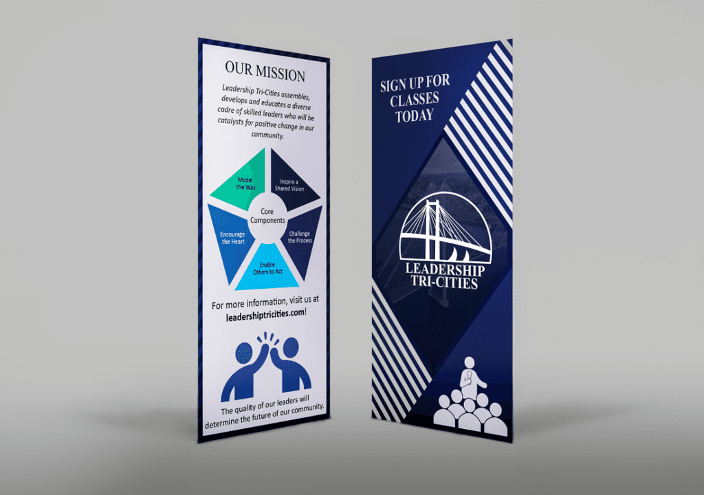
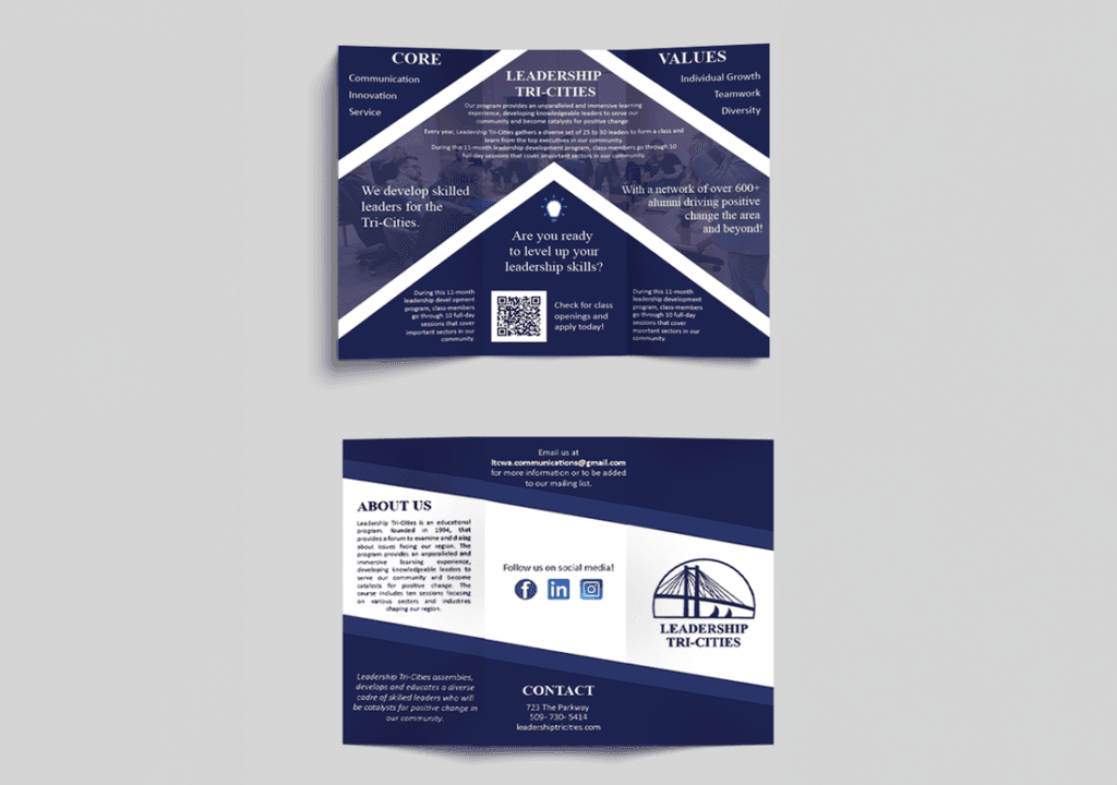
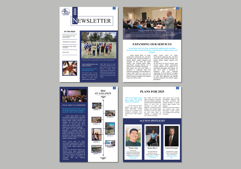
Leadership Tri-Cities is a nonprofit organization focused on developing community leaders through programming and engagement. I worked on this project as part of my undergraduate studies, supporting the creation of print and digital materials while adhering to an established brand identity.
The Challenge
Unlike early-stage or evolving brands, Leadership Tri-Cities already had a defined visual identity and brand guidelines in place. The challenge was not to reinvent the brand, but to apply it consistently and thoughtfully across a range of materials while ensuring clarity, accessibility, and alignment with the organization’s mission.
My Role
I contributed to the design of brochures, newsletters, and other physical and digital assets, working within existing brand guidelines. My role focused on translating those guidelines into usable materials that supported communication goals without compromising brand integrity.
Approach
I approached this work with an emphasis on brand stewardship. Rather than treating guidelines as constraints, I used them as a framework for consistency and clarity. Each asset was designed with attention to hierarchy, readability, and tone, ensuring that the materials felt cohesive with the broader brand while remaining practical and effective for their intended audience.
Outcome
The resulting materials aligned closely with Leadership Tri-Cities’ established brand and supported their outreach and communication efforts. The project reinforced the importance of consistency in building trust and recognition, especially for organizations that rely on long-term community relationships.
Sample Work

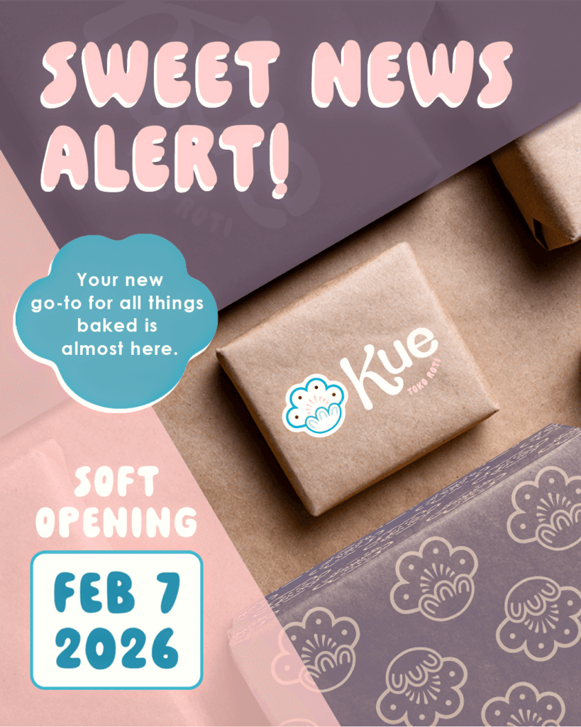
Kue
Context
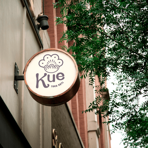
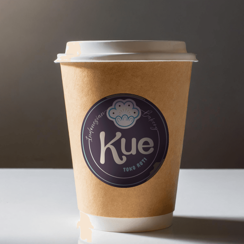
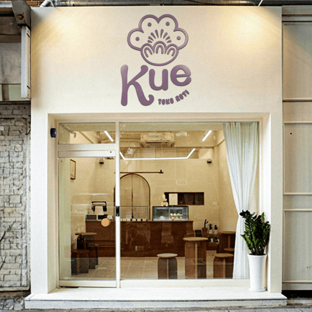
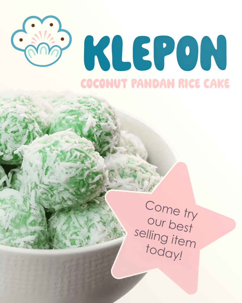
This project was part of an undergraduate course focused on brand development. I selected the food industry and developed a concept for an Indonesian-inspired bakery, exploring how cultural influence, product design, and physical space could come together as a cohesive brand experience.
The Challenge
The challenge was to build a brand from the ground up within a hypothetical but realistic context. Without an existing business or client, the focus shifted to making intentional decisions about positioning, audience, and experience—while ensuring the brand felt cohesive across physical space, packaging, and digital presence.
My Role
I developed the brand concept independently, defining the bakery’s identity, product offerings, and visual direction. This included conceptualizing the in-store experience, packaging, and social media presence as parts of a single system rather than isolated design elements.
Approach
I approached the project by thinking holistically about how a brand shows up in everyday interactions. Rather than starting with visuals alone, I focused on the experience: how customers might encounter the space, interact with the products, and recognize the brand across touchpoints. Cultural inspiration informed the tone and aesthetic, while consistency guided decisions around layout, packaging, and messaging.
Outcome
The final result was a fully realized brand concept that demonstrated how a business in the food industry could express identity and values through design choices across physical and digital environments. The project served as an exercise in translating abstract ideas into a coherent, end-to-end brand system.
Sample Work